
Publishing your book is a huge achievement. You’ve poured months, maybe even years, into crafting your story, refining your characters, and polishing every word. Hitting that “publish” button is one of the proudest moments an author can have.
But here’s the truth: even after all that hard work, small mistakes can slip through. And that’s okay.
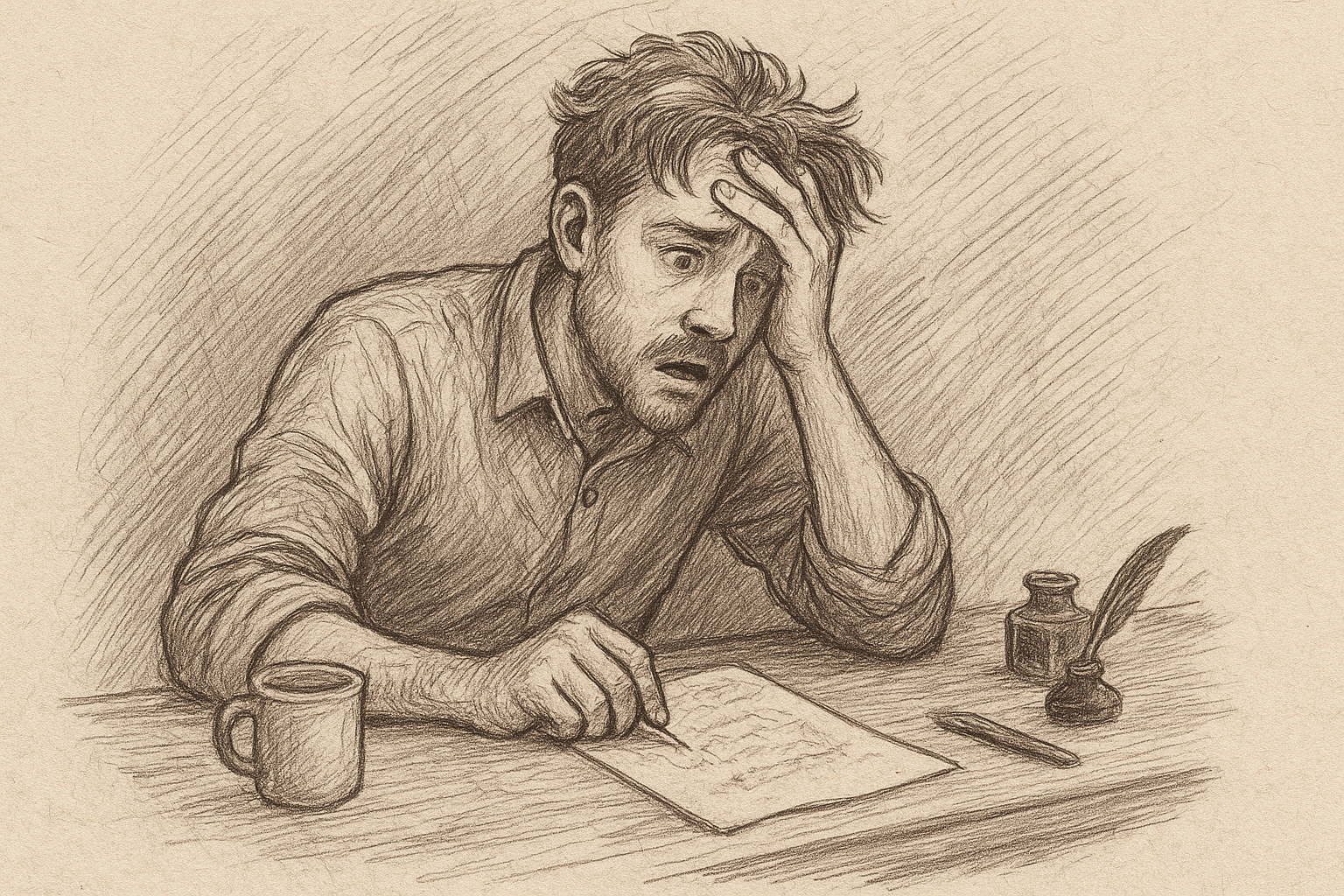
I learned this firsthand. After my book was released, a friend messaged me to let me know something was off. My formatting was messed up—every single first-line indentation was missing! At first, I was horrified. I felt embarrassed knowing a few sales had already gone through with the error.
For a moment, frustration got the better of me. I beat myself up for a few days, But then I remembered, this wasn’t the end of the world. It was fixable.
So instead of falling into depression, I took a deep breath, went back to the manuscript, and corrected the formatting. I re-uploaded the book and made sure the new version was exactly how I had envisioned it.
And you know what? That simple act of fixing the issue made me feel stronger as an author. I realized that publishing isn’t about perfection—it’s about progress. Every step, even the missteps, is part of the journey.
These errors seem minor, but they can affect the reader’s experience and even your professional credibility. Here are some of the most common mistakes authors notice after publication—and how you can avoid them.
1. Missing First-Line Indentation
One of the easiest formatting oversights is forgetting to indent the first line of each paragraph. Without it, your text can look flat and harder to read. Readers subconsciously expect that visual cue, and when it’s missing, the page feels unfinished.
Tip: Always use paragraph styles in your word processor or formatting tool. Avoid hitting the space bar or tab key manually—those fixes often break during conversion to eBook or print formats.
2. Inconsistent Line Spacing
Sometimes, authors mix single, 1.15, or double spacing without realizing it. On the printed page or eReader, this inconsistency looks unprofessional.
Tip: Choose a consistent line spacing before you export, usually 1.15 or 1.2 for eBooks and around 1.15–1.5 for print.
3. Ragged Margins or Justification Errors
A book with uneven margins or strange justification can pull readers out of the story. Some pages may look cramped, while others appear too spaced out.
Tip: Use the formatting standards recommended by your distribution platform (Amazon KDP, IngramSpark, etc.). For print, full justification usually looks the cleanest.
4. Inconsistent Chapter Headings
Chapter titles that don’t match—some centered, some left-aligned, some in all caps—can make your book feel less polished.
Tip: Create a style sheet before formatting. Consistency in headings gives your book a professional finish.
5. Orphans and Widows
In publishing, “orphans” are single lines of text left stranded at the top or bottom of a page. They’re distracting and give the impression of sloppy formatting.
Tip: Most formatting software lets you control widow/orphan lines. If you’re doing it manually, double-check your layout before approving your proof.
6. Typos or Grammar Errors That Slip Through
Even with proofreading, some errors inevitably make it to the final version. And readers will notice.
Tip: Hire a professional proofreader or use multiple beta readers. Fresh eyes are invaluable for spotting errors you’ve grown blind to.
Final Thoughts
Mistakes happen. Even bestselling authors have released editions with formatting flaws. The key is to minimize them before publishing—and if you do find issues afterward, don’t panic. Most platforms allow you to upload a corrected file.
A well-formatted book isn’t just about looks. It’s about showing respect for your readers. It gives your story the professional presentation it deserves.
Have you ever noticed a formatting mistake in a book, weather it is your own or someone else’s? Share your experience in the comments below!
Leave a Reply